One of the hidden attractions of Facebook for many users has been its photo album services. Consider the line up – easy to use albums which can be captioned, sorted and organized to your hearts content. It is easy to import/upload to your albums including appending onto an existing album, exchanging photos between albums or creating a new one. And with added features such as easy transfer of images between albums, comments for individual photos and even face recognition and tagging; many Facebook users are often refugees from Flickr, Fotki and other public photo album services . And why not? Many of the services have a range of control like s a limit to the number of set/albums or the number of images stored or some restrictions on album features and organization . In sum, Facebook’s photo albums and services has been an invisible pillar of loyalty and strength for Facebook.
So when Ye Editor considered moving over to Google+ for circles, hangouts and less privacy worries [really, Facebook is worse than Google] – the concern was that Google+ could not match the Facebook Photo Goodies. Well this note is all about why one can sayGoogle+ not just matches but in several areas exceeds the photo-handling capabilities of Facebook.
Input and Photo Organization
Google+ starts off with a very adept image upload process:
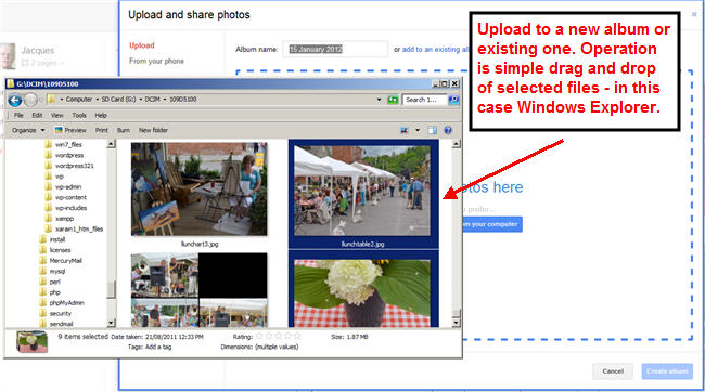
One can simply drag and drop image files from your favorite file viewer or image organizer onto the online Google+ upload pane. Google+ immeiately leaps into action with a multithread upload[ 5 concurrent operations in recent upload activities]. While uploading you can add captions to the photos already uploaded as seen here:
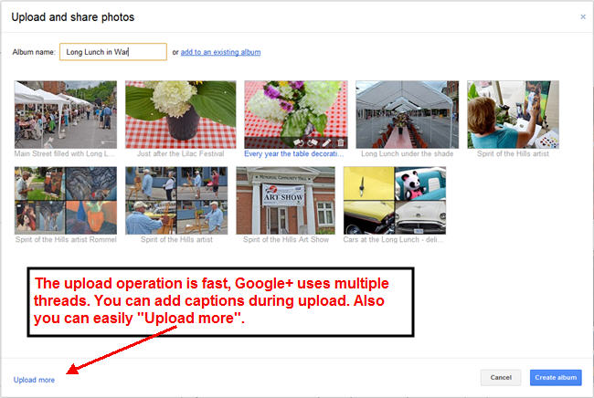
Uploading more images into the album is just a click away. Then when you click “Create Album”, Google+ asks if you want to tag faces found in the images uploaded [you can skip this step]. Finally the album can be targeted for viewing by specific Google+ circles as you are queried on sharing permissions before the album is finally created. It is also possible to reorganize the order of the pictures in the album or transfer to and from other Google+ Web albums using Google’s Picasa desktop tool.
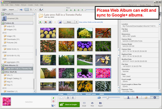
Picasa has several tie in including syncing so any changes made in Google+ or Picasa are seen in the software. This is handy on changing the order or what album[s] a picture may be residing in. However, this user does not like the aggressive approach taken by Picasa – it constantly wants to be your master file viewer and desktop image organizaer and pursues such status relentlessly like web browsers do for default online browsing . This is the one major drawback to an otherwise very effective Google+ Photo service.
Here is how the new album appears in the Google+ list of posts:
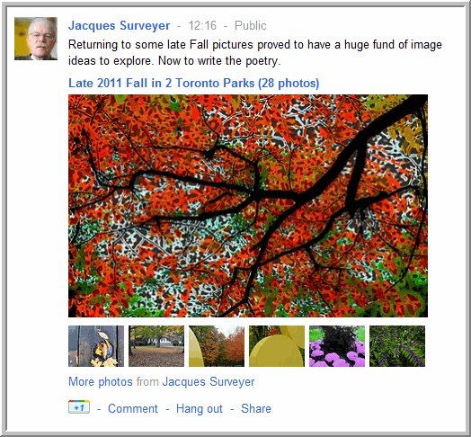
Nice posting and the thumbnails along the bottom is a nice touch sure to be imitated by Facebook, Tumblr and others.
Image Viewing Delights
The big surprise is the quality of the image viewing. One has gotten used to the Google minimalist approach to user interface design in almost all of its online applications. So frankly ye Editor was not expecting much in the view of all Albums or individual albums. But Google+ designershave done a top notch job at every step of the way. Take a look at the view of all Albums:
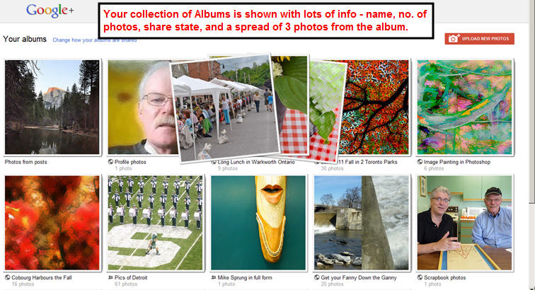
If you hover your mouse over a specific album, Google+ shows a spread of three images from the album – this is very handy when looking through dozens of albums. Also you get info on total count of images in the album and its share status. Quietly helpful.
Click on an album and this is the album view that pops up:
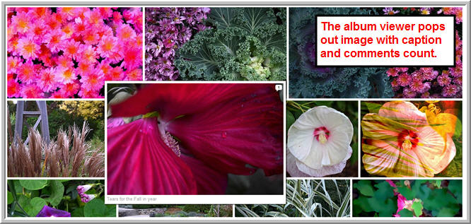
Again Google+ designers have done a nifty trick – the images are densely packed on screen. But again, when you hover with the mouse over a specific image it pops up in in full dimensions with its caption underneath [if you have supplied a caption] and a count of the number of comments for the image. This again is wonderful when you want to quickly browse through an album and see whats there or find out viewers reactions.
However, click on an image and get taken to a very good image viewer whose touches put it a at least two steps of the Facebook image viewer:
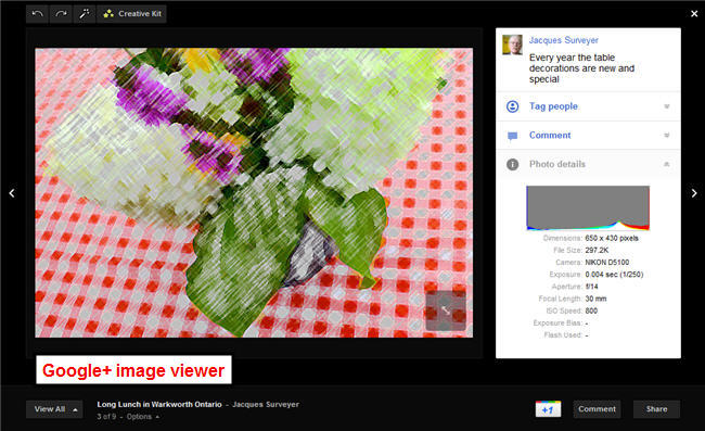
The Google+ image viewer has 4 nifty features yet to appear in the Facebook viewer:
1)black background and no ads[so far];
2)the right sidebar does the right balance of comments and image info;
3)full screen view in which the right comment and info sidebar disappears[click the semitransparent icon in the lower right of the image];
4)in full screen view the caption appears at the bottom of the image but fades awya after 4 seconds.
Compare this with the Facebook image viewer:
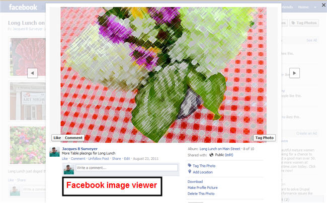
The semi-transparent white background just does not work for this viewer. However, as noted above ye Editor fully expects Facebook to match the the current leading Google+ image viewer features in the coming months. However having done that catch-up, the Facebook crew will have another feature to match – the View All command in the lower right which, when clicked, produces this view:
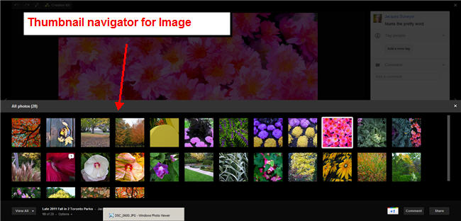
The thumbnails allow the user to quickly navigate to the next image desired – again when flipping through dozens of images this is a god-send feature. But wait Facebook engineers you are still not done. Check the upper left corner of the Google+ viewer for it piece de resistance – the Cretive Kit. This allows Google+ users to edit with the verycompetent Picnik online editor any of the ir album images.
Image Editing Online
Picnik has been one of the best online photo editors and a tribute of what can be done in JavaScript programmming. What Google+ engineers done is brought the Picnik to Google+ images. So if you feel that cropping needs change or the color balance is off, the Creative Kit allows you to make those changes:
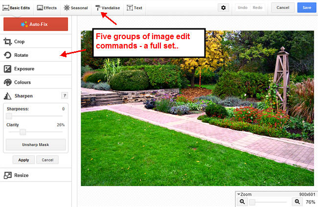
the Basic Edit commands allow the most common edits:
1)Crop – for last minute photo composition changes
2)Rotation – get the photo on-kilter
3)Exposure – to get the brightness contrast on with some sophisticated tools
4)Colour – to rebalance the color tinting in an image
5)Sharpness – again, some sophisticated sharpening tools- but do not expect miracles
6)Resize – up or down, a godsend again
There are 4 other group of commands: Effects, Seasonal, Vandalise[check this out], and Text which provides some creative and sophisticated processing opportunities. See an example here:
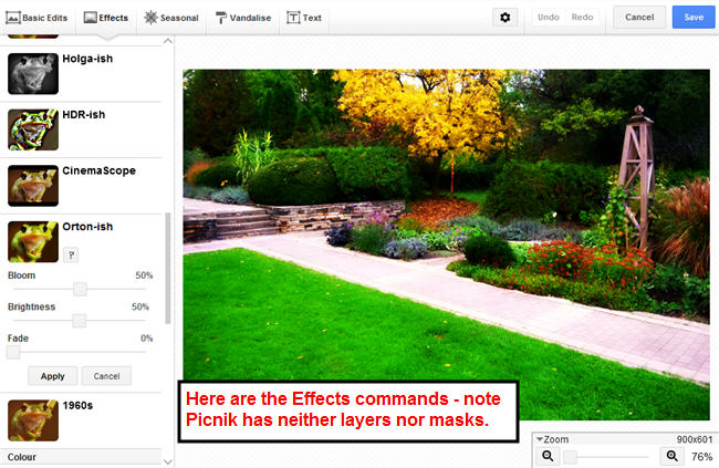
As you can see from the caption, the one problem with this version of Picnik is that layers and masks are not supported. However, the Creative Kit has been already been vital in making last minute changes to a clients Google+ Page. Given fast load times and good responsiveness on a medium-bandwidth connection, Creative Kit is a real winner for Google+ Photo services.
Summary
Along with Circles, Hangouts and new broader Google search capabilities, Google+ has become an ever more serious challenger to Facebook. By now also providing top-notch photo services Google+has become even more appealing to those who want to do more with their smartphone and compact camera images. Google+ has a winning online image uploading, viewing and editing tool in social media. True the use of Picasa for organizing images from the desktop plus the lack of masks and layers in the online editor are gaps to be filled. But right now Google+ Albums with its superior viewers are the best photo services in the social media space.
