
A Touch of Color works very well in photofinishing. By lowering an image to just hints of the original hues or leaving just traces of the original full colors, graphic artists have attractive design alternatives. This post will look at a range of color hints and touches available to photofinishers.
Full Color Traces
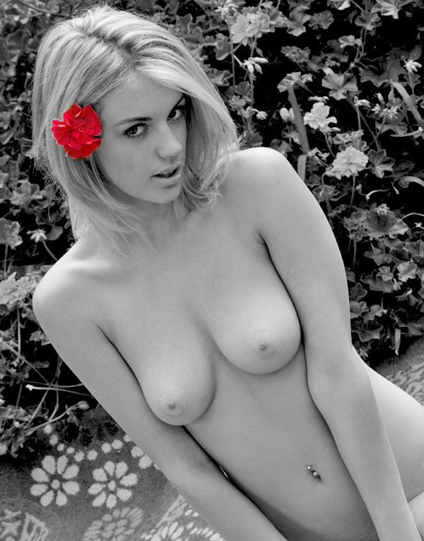
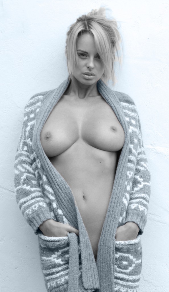
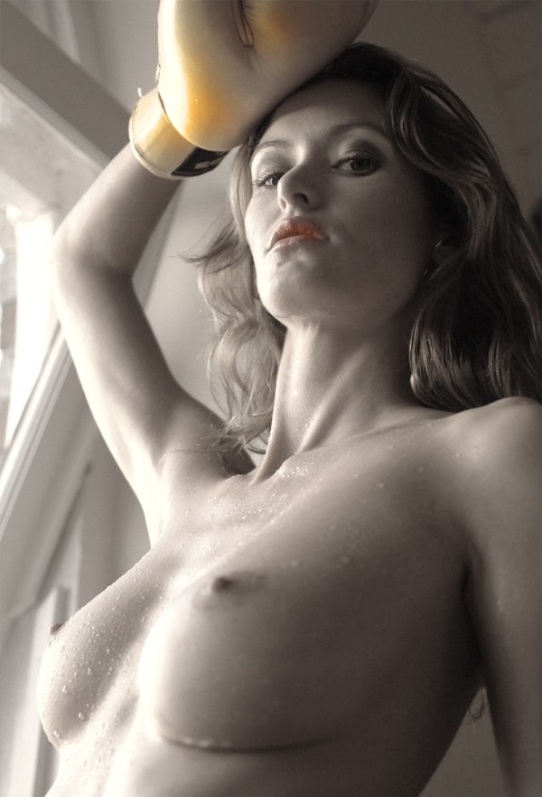
It would appear that full traces would be easy to do – and from a photofinishing viewpoint they are. Just mask off the region of full color, and desaturate or convert to black and white everywhere else. But some times the full color is just too powerful as in this nude model from Erosberry:
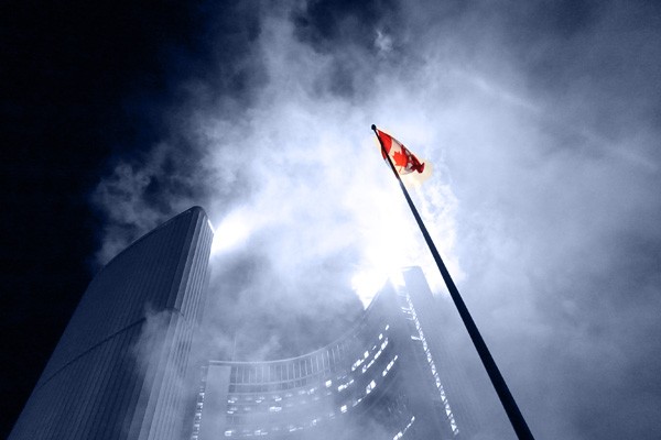
In contrast, the color traces in this photo from the 2015 City of Toronto Holiday Season of Lights event worked very well. the full colour hints draw the viewrs eyes into the image while adding a sense of the evenings spectacle and drama.
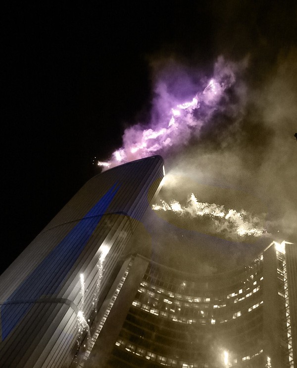
Some might argue that red is just too strong for touch of color images. However, the following shot also from the Winter Season of Lights festival would appear to belie that idea.
Partial Color Traces
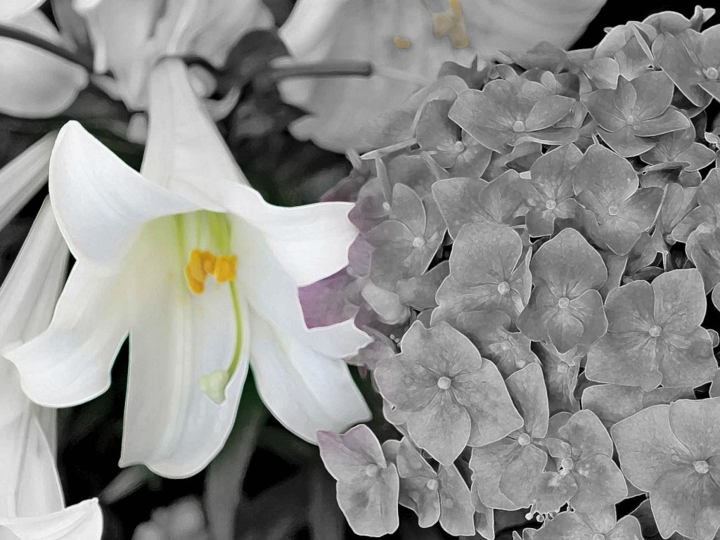
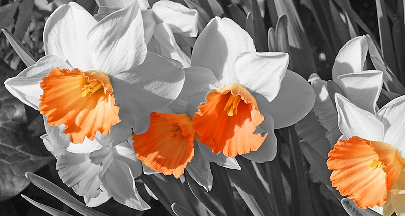
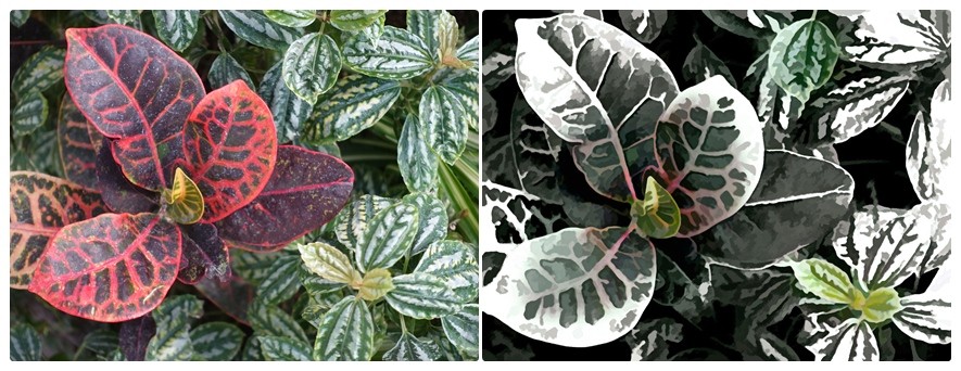
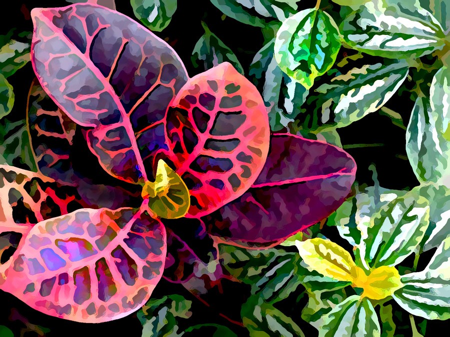
So the logical approach is to leave only partial color traces by desaturating the color spots left on the image. Here is another Allan Gardens floral image in which all of the color hints have been desaturated:
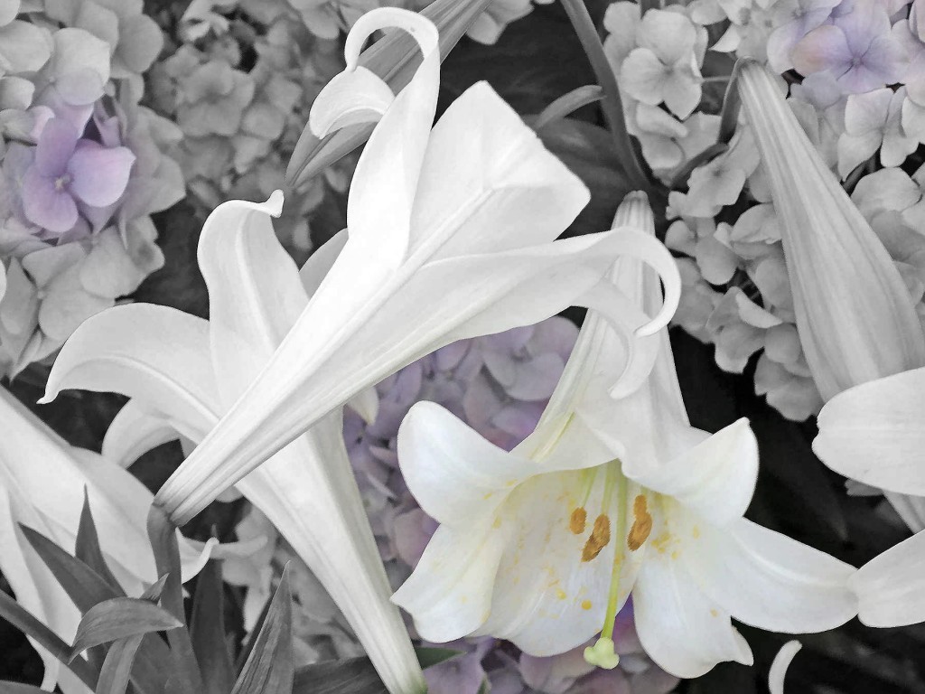
There is an element of surprise as the three muted hyacinth colors guide the eyes scanning of the photo. The stamen and pistils strong yellow color has been muted so the lily colors do not dominate. This helps bring out the pure white of the other lilies.
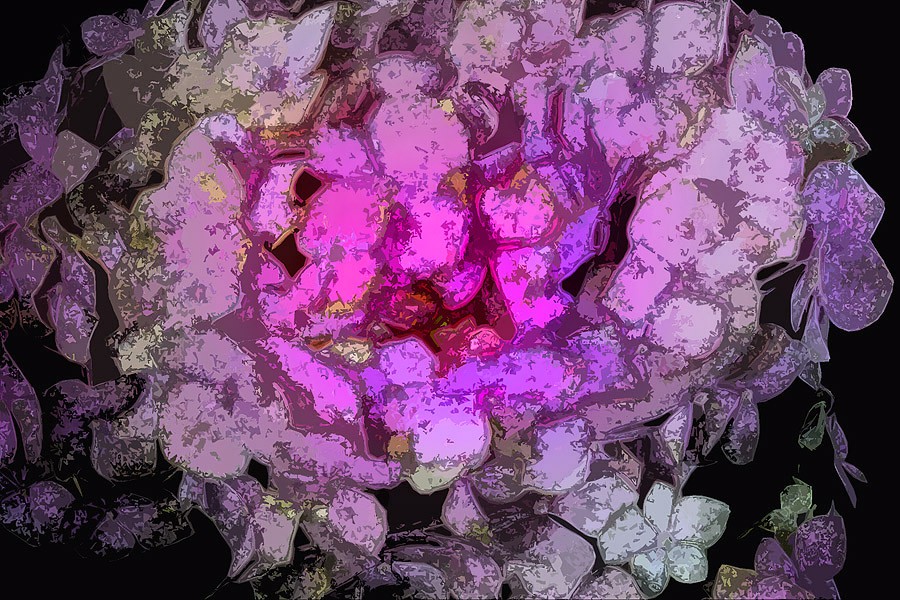
In the next use of partial colors we concentrate on the center and then work out – the image is from Allan Gardens rival Edwards Gardens::
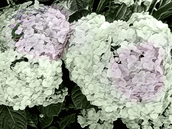
But partial colors do not always work as seen below:
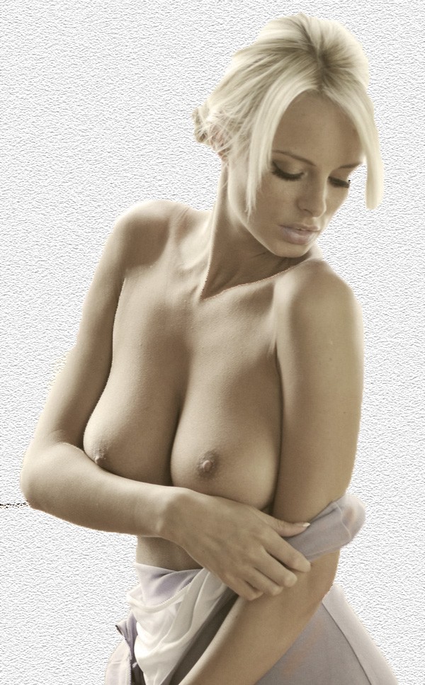
Better is to use complete partial color as in this Erosberry.com model by way of Body in Mind. Here all the colors are muted to partial transparency so the skin and hair suggest the natural hues while the rest of the image is a Black+White adjustment in Photoshop with a slight cyan tint.
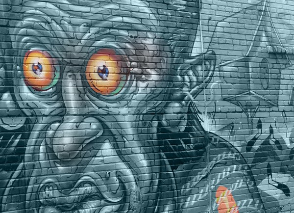
In addition some wild and wooly graffiti from the Janes Walk in Toronto also profits from using partial colors:

As you can see the original is quite colorful; but in the BW+Partial Color even the shades had to muted, giving the image a droll look while the B+W reveals neat drawing details.
But as we have already seen its almost a natural to use tints, textures and other changes to add emphasis to the Touches of Color.So lets look at how that works out.
Tints, Textures and Blends for a Touch of Color
Tints are a natural when doing a touch of color. Take a look at the same ErosBerry model this time sepia tinted and hiding behind a full color floral lei: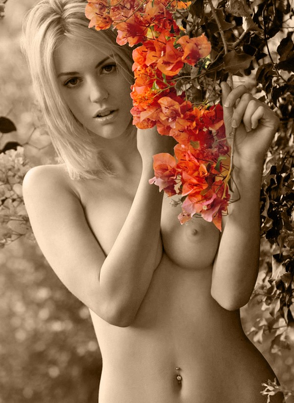
And for a graffiti shot, again using a gray-greeen tint combines well with the full color touches of color giving the garage side mural a slightly whimisical style
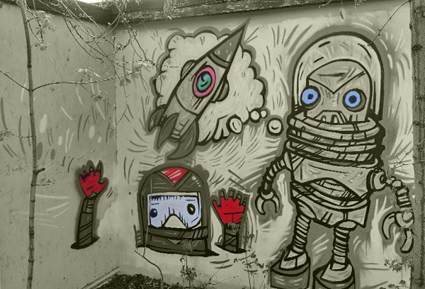
This is a series of novel graffiti found on Dundas just West over the bridge from Lansdowne.
The next example is a triple hitter using a background texture change with full body partial tinting plus a body tone blend to add subtle refinement to a Body in Mind model:
In contrast adjustment to this Dundas Street graffiti are bold:
In a similar fashion another Body in Mind nude model inspires a gamut of color touches:
Here there is a full image light tawny tint and two partial touches of color to the boxing glove and the model’s lips. But that didn’t quite work out so the a portion of the glove’s color was exaggerated giving more “punch”. Finally the model’s left breast is slightly out of focus but sharpening just made things worse..
Now a final look at more than a touch of color:
Summary
A Touch of Color works on the Less is More theory. And using touches of color on black and white or tints can work. But the design pattern is not fool proof and can go awry as seen above. But most interesting is that Less can often mean More work for photofinishers.