
Just over 5 years ago thePhotoFinishes.com did a review of online color design sites. Ye Editor was astonished to find over 27 sites available for painters, designers and photographers. Then a year ago, a photo colleague pointed out some new sites and said they deserved coverage which these new color sites got here. this last few months mentoring duties have included some tutorials on Web Design. One of the topics to cover i the tutorials looks at how to do good color design for a website.
So in response the last two postings on Color Design Tools were tops on the agenda for review. In addition, there are some great new color design resources appearing online that can help photofinishers in selecting and later refining their images. The following infographic and color theory explained provide solid basis for decribing approaches to color design decisions.
Click on the live screen to see more or click here to go to the website.The fascination shown in the Causes of Color is how colors are made in additive fashion [which is demo-ed below] but also by some color agent being lost or removed; hence a new hue emerges. Also colors are constantly moving as sunlight changes through a day while the weather filters in myriad ways.
But if you truly want to know the Physics of Light this fascinating website tells the complete story.
Again click on the live screen to see more or click here to go to the Physics of Light website.
If you are a camera buff or photographer, this site provides detailed insights on how diffraction, refraction and lighting effects work so you can understand how to shape light using lenses, filters, diffraction gratings and other optical instruments. However be prepared for some far from ‘light’ reading.
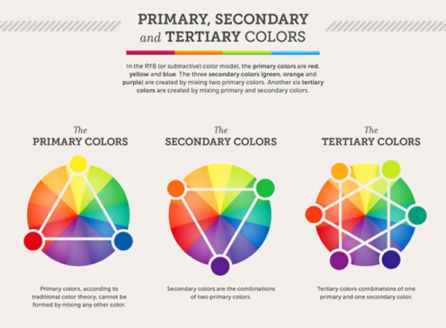
Most photographers are familiar with color mixing as shown graphically below:
What is nifty is to be able to see these color tetrads and try out their effects. Adobe Kuler provides:
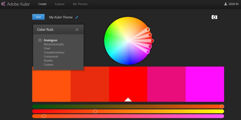
Kuler has improved over the past 5 years with simplified UI and more color rules available in the pulldown.
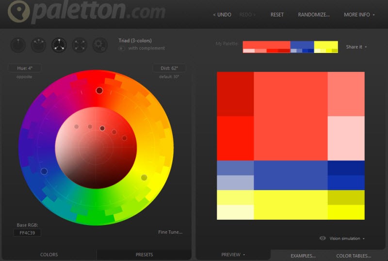
There is more method to color choice beyond the basic compliments & variations as seen below:

To see these schemes best switch from the the good of Kuler to the much better of Paletton.com
Click here to go to the Paletton.com website
Paletton.com provides all of Kuler’s Color Rules but with 5 added advantages for doing your color designs. First it is much easier to rotate the primary color rule plus change the placement of the base color and its 4 analogous variant hues in the left designer panel. Second, one sees the color mix in a grid in the second panel. This grid layout is subject to change with various text and bar layouts. Third, Paletton provides vision simulations so you can see for accessibility purposes how your color scheme looks to people with 7 different common color blindness deficits. Also, the visual simulations show what happens with poor printing or CRT conditions.
But the real kickers for Paletton are Examples and Color Tables tabs in the lower righthand corner:
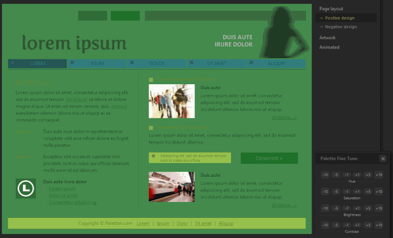
This preview mode lets designers see the color choices on a simulated web page. The Fine tune option allows for corrections in Hue, Saturation, Brightness and Contrast. The changes are reflected on the preview Web page nearly instantly – proving to be very helpful when working out a color design. Changes made here are also made to your color wheel settings.
The fifth and final advantage to the Paletton Color Designer is the Export Tables. One can export the color wheel primary and secondary color choices in 7 formats: PNG image file, HTML, CSS, LESS, XML, Text, Photoshop ACO, and GIMP GPL. These color schemes are given in RGB Hex, RGB 255, RGBA 255, RGB 100%, CMYK, and LAB. PAL and Pantone values used to be provided as well but the respective companies currently prohibit that. But despite these missing color codes, Paletton.com remains on the top rung for color design. Being able to testview and change color schemes so quickly make Paletton.com the best place to be for Web Designers making website color refinements.
Summary
When thePhotoFinishes.com did its Online Color Resources story 5 years ago, ye Editor was concerned how many of the websites would survive the challenging economic conditions. To my surprise most did and as in the case of Paletton.com, added winning features. The result is that for web color refinement and finishing work, online is the place to be.