
As a photographer and Web designer I constantly get asked to create photo grids of products, events, travel pictures,etc. And for the most part this is not a problem because each picture or thumbnail fits a common, agreed upon dimension – 320 x 240 pixels or whatever the client needs. For example:

This list of artists, all thumbnails are the same size 300×199 pixel so Isotope Filter Grid can be used
Isotope brig the advantage that the grid of images can be filtered so just Painter or just Fabric artists can be shown. But even Isotope has a problem when one of the two dimensions [width or height] varies in length among the images. Isotope will handle this situation but the display time is slower and the grid prone to an uneven layout. Even more vexing is when the dimensions are not the same and cropping to size is not allowed [yes, think product grid photos]. The big problem now is that more often clients are providing images with only one dimension fixed or none at all while providing unreal cropping/resizing limits and delivery time constraints. Lots of hair pulling and gastric indigestion ensue.
Rolaids … Fleximage For Relief
While looking for a WordPress plugin for an animated, responsive slider, I stumbled on Pixaby’s Fleximage:
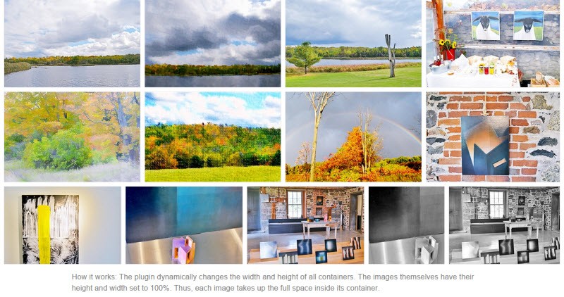
Fleximage is a jQuery-based routie that fits images of varying dimensions into a grid stated maximum row heigh. Fleximage adapts the row height to guarantee that all images in a row will a) fit into a standard length and b)each image in the row will never be truncated but will be shown to its full aspect ratio but at overall cotainer row height or less in size. It is the classic optimum container packing algorithm from Operations Research. And as you can see from the screen shot above, Fleximage is versatile in displaying a grid of images eve when the images vary in actual size.
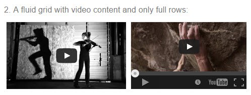
Can Fleximage handle video images while delivering responsive fluid sizing?
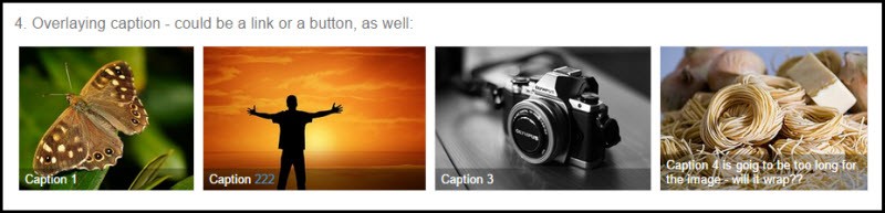
Can Fleximage deliver captions and links within those captions?
Finally, does Fleximage support lazy-loading for faster loading and display of large product grids?
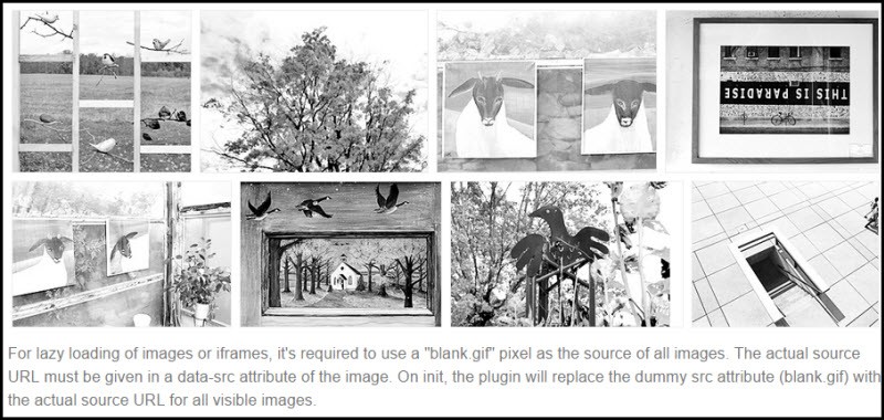
Yes, Fleximage does support lazy loading of images like Isotope. Note in this screenshot the rows are of different heights as Fleximage shrinks to fit all the images into a fixed length. So the image grid has a fixed overall width ad a mximum row height for each row.This is where Fleximage differs from Isotope which does not fit images into fixed maximum row heights. But the Fleximage cannot do the filtering of images which Isotope can do. But what is vital is both are free JavaScript plugins with each having very helpful documentation.
Summary
With Fleximage I have found a routine that can fit varying size images into a constant width grid. Yet these images can have captions, links, and contain videos or iframes. Fleximage as a JavaScript routine can be used very effectively with Foundation, Ink, or Bootstrap JavaScript SPA-Single Page Application frameworks. In addition, using iframes, Fleximage can be used in WordPress or Drupal and other CMS. In sum, Fleximage is another great JavaScript grid display solution.