DesignCap.com is an online poster and cards creator. It looks like Canva.com from about 4 years ago. Take a look:

The basic sidebar menu on the left is nearly identical – Templates of poster and card designs is the starting point:

Now DesignCap has two dozen categories for their templates covering a wide range of poster and card designs. However, all f the designs are vertical in nature – this is surprising because horizontal posters and cards are as common as vertical ones. Not sure why DesignCap made this choice.
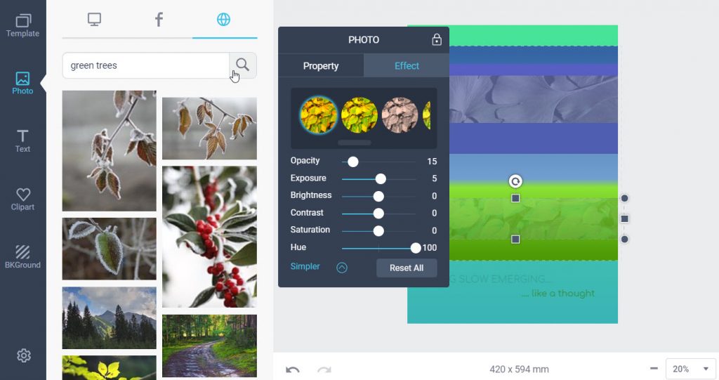
The next design option is Photo and here DesignCap really shines as seen in the screenshot below:


Third, DesignCap allows users to set the text layer backward or forward in the emerging stack of image, text and shape in the design. This is vital in complex layouts.
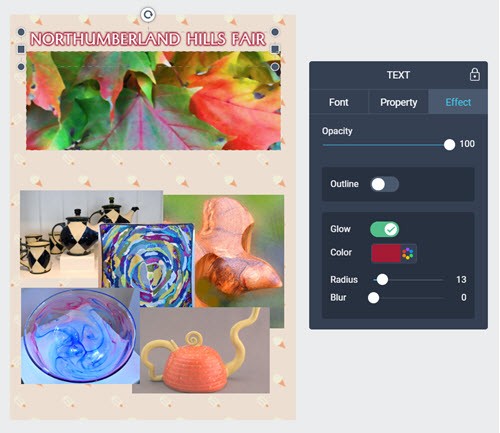
There are three Text effects that make for refined designs. First users can control the opacity over the full range of 0-for transparent to 100 for fully visible. Second, users can specify an outline around the text. This is not a drop shadow which is directional.
Third, DesignCap supports a glow which is to this viewer’s eye is the same as an outline but the user gets to control the color, radius and blur of the glow. Now given the implementation of glow, one has to ask why not change outline to a drop shadow ?
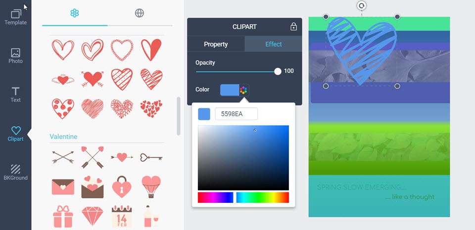
Clipart is a simple but effective way to get vector drawings into DesignCap as shown in the screenshot:

Clip Art has 3 dozen preset categories of vector clip art which,like Text and Photos, can be dragged and dropped onto the canvas, then resized up or down and finally rotated as desired. Also Clip Art can be advanced forward or back in the stack of object layers on the canvas using the Property tab in its popup control window. The Color tab allows users to change the color and opacity of the Clip Art. This is a bit too simple as we shall see with backgrounds below.

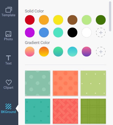
Backgrounds as shown in the screenshot to the left start out very promisingly. One can choose a preset solid color or color pick the excat color you want using the dotted circle + icon. Next, you can choose one of the gradient color presets or again create your own gradient using the dotted circle + icon.
And finally users have a choice of about 30 patterns; not nearly as ample as the number of patterns available in Photoscape X – so just import the pattern image from there.
So the choice of background is very good in DesignCap. But, just like in Canva, there are severe restrictions where backgrounds can be applied. Not to Clip Art nor Text but just the lowest layer of the Design Cap.
This is so frustrating because an otherwise elegant tool, with simple design mechanics is almost tragically flawed by three shortcomings:
1)the dimensions of a DesignCap canvas are vertically biased and not subject to user customization. It would be nice to control this in a missing blank canvas;
2)the background only applies to the lowest layer of the Design canvas;
3)it is possible to lose layers in the stack of elements especially if the stack is 5 or more layers deep. Like Canva, DesignCap needs a popup which shows the layers of elements like Bannersnack’s UI.
Summary
Yes, like Canva, DesignCap support free output for now to JPG, PNG or PDF files. Yes, like Canva, lacks a clear display of the current element layers in a stack that can be manipulated. Yes, even better than Canva has a broader choices of clip art, photos, and background. But like Canva the use of backgrounds is severely limited. But DesignCap lacks the breadth of templates that Canva has. And Canva has a premium Team Work version with 8 extensions that is not currently matched by DesignCap.
So this reviewer, who likes the simple and fast interface will use DesignCap for specialty layouts like posters and vertical cards but look to Canva, Snappa or Stencil for broader graphic design tasks.
