
Two significant trends have emerged in website design during the past year that influence better web space usage:
- The size of individual webpages grew rapidly. The average size of a webpage increased from 1.28 MB at year-end 2012 to 1.9 MB at year-end 2015. That’s a big jump, especially when you consider that in 2010, the average size of a webpage was 726 KB.
- Images played a huge part in this growth. Images have grown from an average of 793 KB per page in 2012 to just over 1 MB per page today. This is more than double the average from 2010, when it was 430 KB.
- In sum – images comprise more than half of all Web page space usage
The bottom line is that managing and displaying your images on the Web is becoming a critical Web development skill. And with WordPress being used on 25% of all websites in the world, knowing what tools to use for your image galleries is becoming more important. This review will look at one of the better and free WordPress plugins for displaying image galleries in their many forms.
FooGallery
This is hardly an inspiring name but the basic features of FooGallery are quite substantial.Unlike Nextgen Gallery, FooGallery does not store the images used in its galleries but rather draws on images from the WP Media Gallery [and also the NextGen Gallery if you activate the FooGallery extension]. But after the images are loaded, FooGallery manages all aspects of creating the gallery to be displayed as shown in this screenshot of the Add Gallery command:
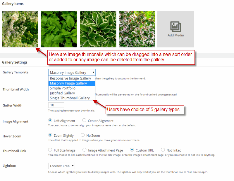
The key first decision is to choose one of the 5 Gallery Templates from the pulldown. This choice will determine the look and layout for the Gallery and its chosen images.
Responsive Gallery Layout
There are five FooGallery types or Gallery Templates and each one has a different set of Gallery settings. First is Responsive Gallery Layout which adapts the gallery layout to the size of the Web page viewport. Setting up the Responsive Layout is easy:
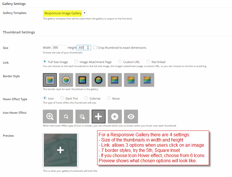
There are 4 basic setting that determine the look and fell of the Responsive Layout. First decide the Size of the individual images or thumbnails. Make the Width a .simple multiple of the page width available. So for thePhotoFinishes that overall content width is about 850 pixels. So to fit two images per row, we make the width 390 pixels which allows for gutter space and border style. Finally if you click the Crop thumbnail check box, all the images will be cropped to fit into the Width and Height specified.
The next option to choose is Link. This option determines what happens when a user clicks on an image in a gallery. Full Size Image will popup a Lightbox showing the fully sized image like so:
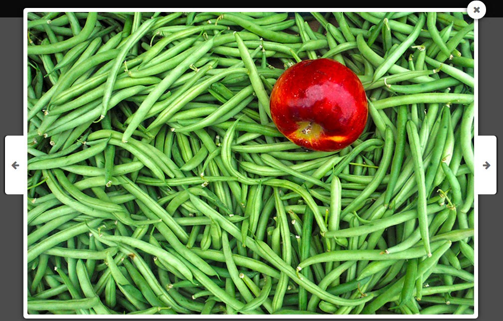
Notice that users can browse through other images in the gallery using the arrow keys. Alternatively you can choose the .Image Attachment Page or the Custom URL. In this case clicking on an gallery image will take users to the URL page linked to. This is the way to setup a Visual Sitemap to your website where a gallery of products or events or people provide a quick click connection to a web page for further help or information. Finally, users can have no links by choosing the Not Linked option. Link is very useful and so is available in all 5 Gallery Templates.
Next there are 7 Border Styles for the Responsive Gallery images – 2 circular masks with and without border, 2 rectangular masks also with and without borders, and then 3 special borders. Try all 7 Border styles and decide which works best for your web page.
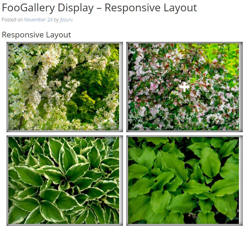
Hover Effect Type gives users the choice of how the image will be treated when hovering with a mouse over a gallery image. Icon enables one of 6 icons appear depending Icon Hover Effect chosen. Tint Darker causes the image to be tinted darker. Colorize causes the image to change from black and white back to its natural colors. And Not Linked call for no imageeffects at all. The image will still respond to a click depending on the Link setting. Finally a Preview image shows what the selected options will look like. And here is what the Responsive Gallery looks like:
Note the responsive layout only applies to the gallery. Users wanting a responsive Web Page would have to use a fully responsive theme like Headway or Pagelines.
Masonry Image Layout
Galleries using the Masonry Layout have become very popular recently for two primary reasons. First, Masonry layout allows users to combine images with different sizes within a single gallery. Combined with captioning and CSS styling, the Masonry layout can also provide a unique and innovative look and feel to a Web Page. Aagain, setting up a Masonry Layout is fairly simple:
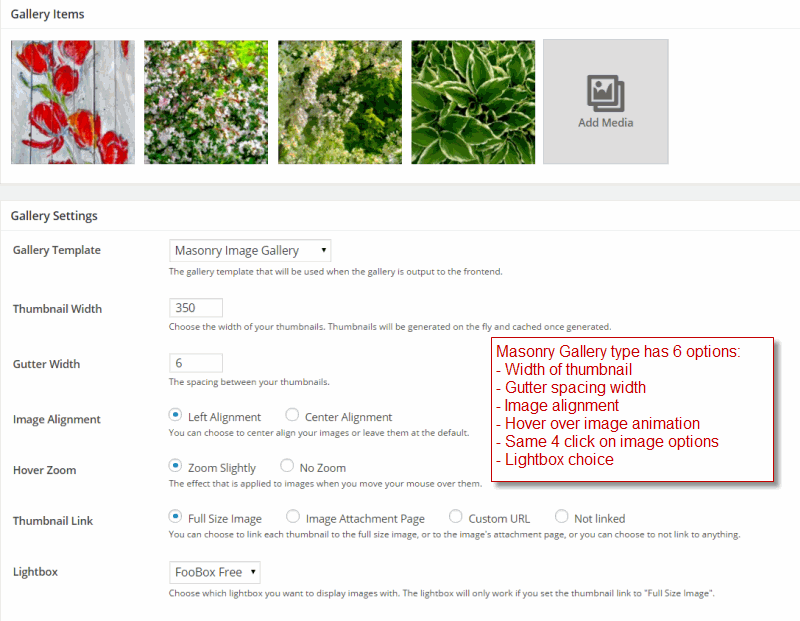
Masonry Gallery has only a Thumbnail Width for image size. Choose a size that matches roughly the number images per row that you want. So if you have 900 pixel wide content area and you want 3 images per gallery row set the width to a value slightly under 300 pixels. Gutter Width determines the spacing between images in the gallery. Unfortunately it is not possible to set the color of the gutter except with some complicated CSS. Image Alignment determine where the gallery is located – i.e Left Alignment or Center Alignment.
Hover Zoom is a special effect that occurs when users hover the mouse over an image – when its turned on the image zooms out by the gutter width. It is a novel visual cue. Thumbnail Link is described in detail here. The key point is that you have 3 choices – popup a Lightbox with the full-size image, transfer to an attachment page or a custom URL, or do nothing. Finally, you can choose the Lightbox. FooGallery comes with an associated free lightbox plugin, Foobox.
Using the settings shown above here is what the Masonry Layout delivers:
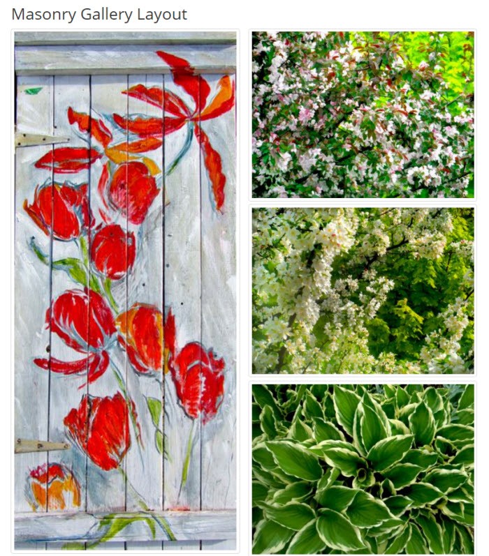
As you can see above the layout can have a stunning effect if the size of the images are carefully chosen. But the Masonry Layout can also be quite practical. Many photo-shoots result in a mix of photo sizes from portrait to landscape. Putting them all-together in a Masonry Gallery can save large chunks of time while still delivering an arresting display of images.
Simple Portfolio Layout
This reviewer fully expected the Simple Portfolio Layout to be the first template offered in the dropdown for 2 reasons. First, it is very simple to setup but also it delivers a compelling style for a gallery of images. Here is how you configure the settings:
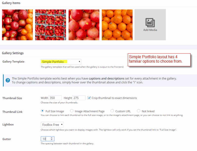
As the advisory says in the screenshot above, it really does pay to have both tile/captioning and a description for each image. The description can include a link to another Web Page which is highly useful. Thumbnail Size allows for both width and height. Also there is a Crop image check box which will make each image fit into the Width and Height dimensions that you have specified. THis is useful when there are dozens of images of nearly the same size – Simple Portfolio trim them to fit neatly. Thumbnail Link works just as in the other layout templates – see here for details.
Again users have a choice of Lightbox; but using the default FooBox is quite serviceable. Remember to download and activate the free version of FooBox here. Finally Gutter determines the spacing between images in the gallery.Here is what the Simple Portfolio looks like:
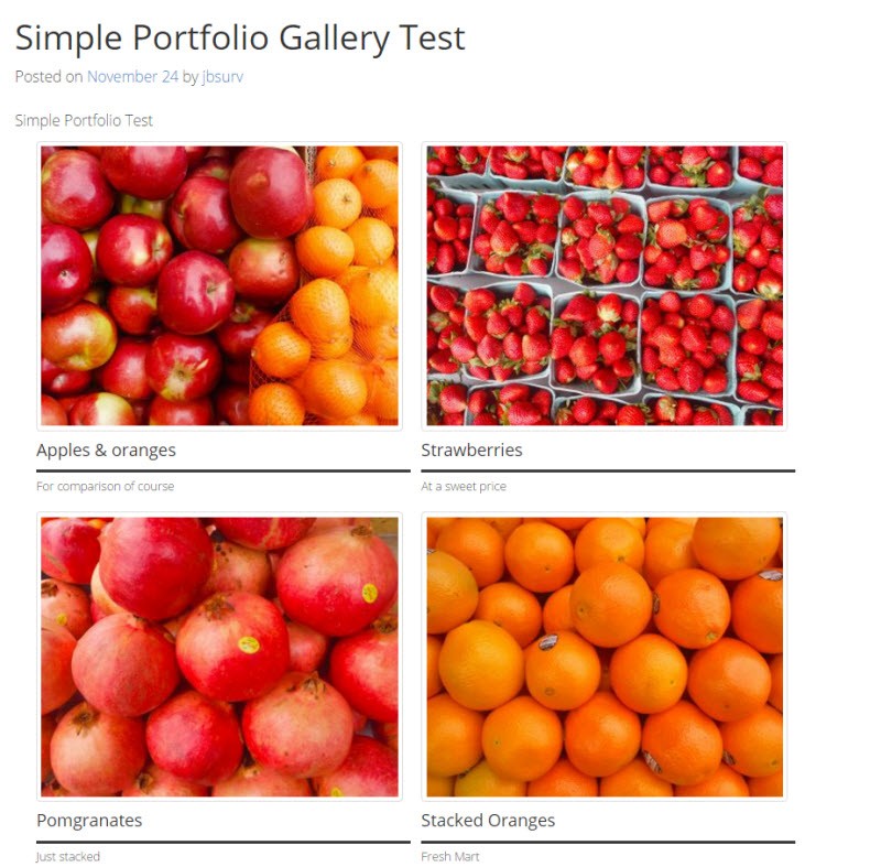
Again it is important to note that users can add links into each image description which then direct customers to more info or a sales cart.
Single Image Layout
At first one thinks of the Single Image layout as slightly crazy. But then consider it as opening up a bounty of related images and information in the lightbox when clicked. The one disadvantage is that the title text that appears when a user hovers over the image is not centered and too small in size [yes, it can be fixed with CSS, but the code is tricky]. Here is how to setup the Single Image Gallery layout:
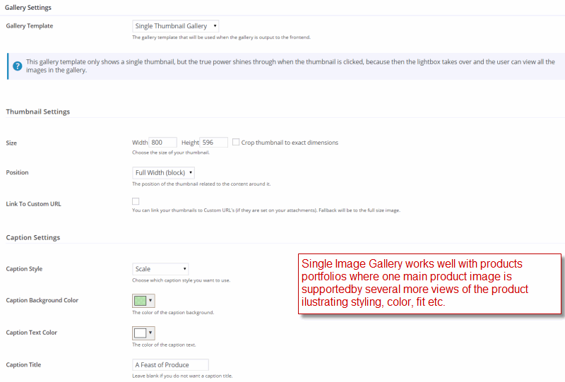
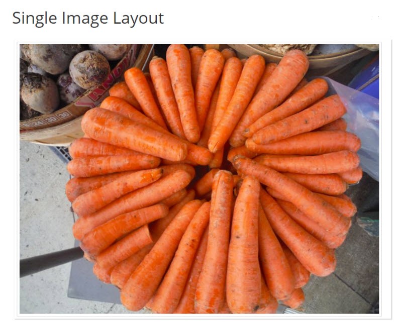
Size and Position settings should be geared to placing a full sized single image within its associated supporting text. Do not click the Link to Custom URL checkbox, otherwise you will lose the link to theother images in the Lightbox. Users can set the color of an overlay, the color of the Caption text and the background color for the Caption. Here is what the resulting Single Image Gallery will look like:
The Single Image Gallery is a typical FooGallery template – it meets a niche need well.
Evaluation and Performance
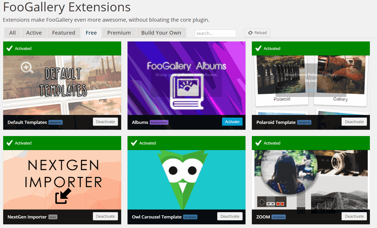
FooGallery certainly delivers a great deal of image gallery features for the right WordPress price – free. Most users will find FooGallery suits their needs with its basic core of 5 templates. But there is more and for free with FooGallery Extensions – 3 more templates, NextGen Gallery imports, plus a host of other features for free or a nominal fee.
I think the FooGallery people have been smart not to overload the basic tool with too many features. The premium Gallery tools like Essential Grid and Justified Image Grid offer a host of added features like infinite scrolling, detailed captioning control, color and transparency settings, links to external photo libraries, animations, and many others. But the learning curve for both of these pro galleries is quite substantial.
However, there is another concern with Foo Galleries. Its runtime performance is taxed when there are more than a dozen images, particularly when Masonry or Justified Image templates are used. Also there appears to be bugs when using Link’s Custom URL option. However, in extensive testing, that is the only major bug encountered so far.
Summary
FooGallery is a real find for photographers and artists that use WordPress to exhibit their portfolios of images/illustrations. The price and most features are right. And the relative ease of setting up galleries is quite helpful as well. Perhaps, the many free and nominal fee extensions will provide the clincher for using FooGallery.